USCIS
Redesigned USCIS's core identity platform from fragmented, paper-heavy casework into a person-centric adjudication interface for 5,000+ users.
Client
USCIS / DHS
Role
Craft Lead, Interaction Design
Duration
6 months
Scope
Field Research, Identity & Case-Management UX, RBAC/ABAC, Delivery
From fragmented evidence to person-centric adjudication
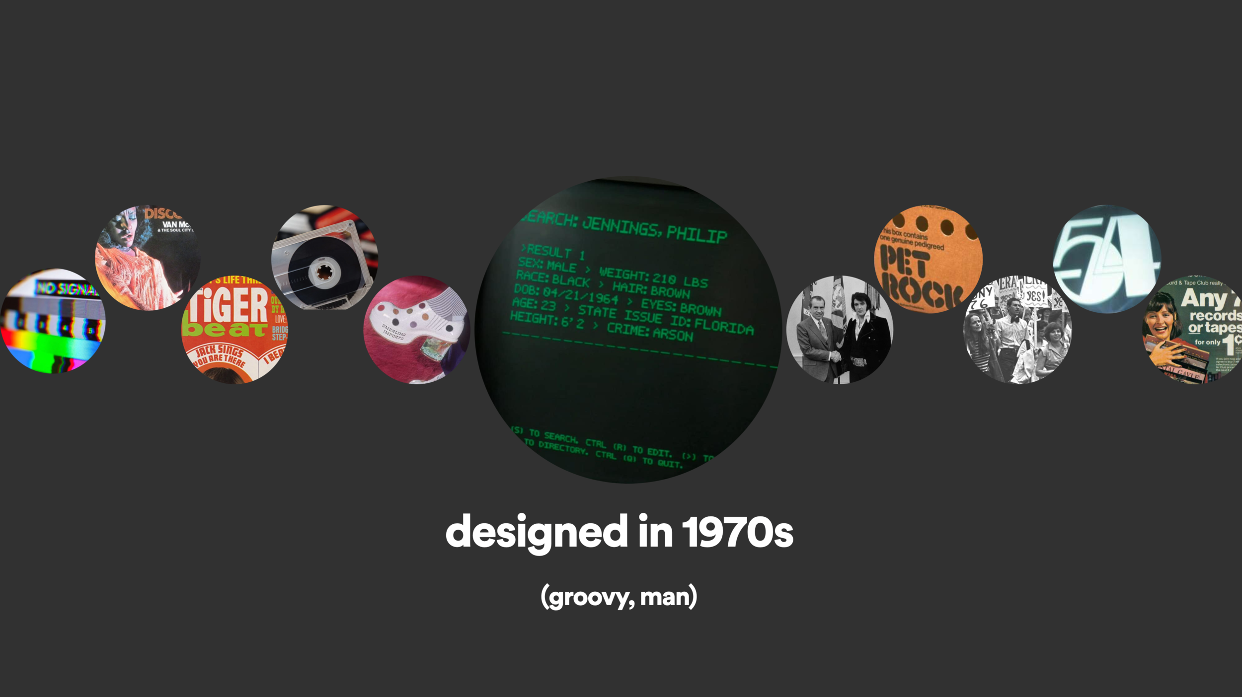
CIS 2 is the main identity system used by USCIS adjudicators to verify applicant qualifications and review historical encounters. Originally designed in the 1970s, it had become the backbone for DHS identity services that downstream platforms depended on, but the work around it had grown increasingly fragmented.
The product challenge was not simply modernizing an old interface. Adjudicators needed to confirm identity, status, eligibility, evidence, and risk across paper files, legacy databases, external systems, and agency-specific workflows at a scale of 5,000+ users processing roughly 35,000 applications per day.
Owning the interaction model across four work streams
As Key Personnel on the contract and Craft Lead for interaction design, I managed a team of 6 designers across 4 work streams while staying hands-on with the core product model, UI patterns, and delivery artifacts. I also served as a face of the work to external stakeholders across USCIS, ICE, and CBP.
0k+
Users
0k
Apps / day
0+
User interviews
0
Design sprint weeks
Starting where adjudication actually happened
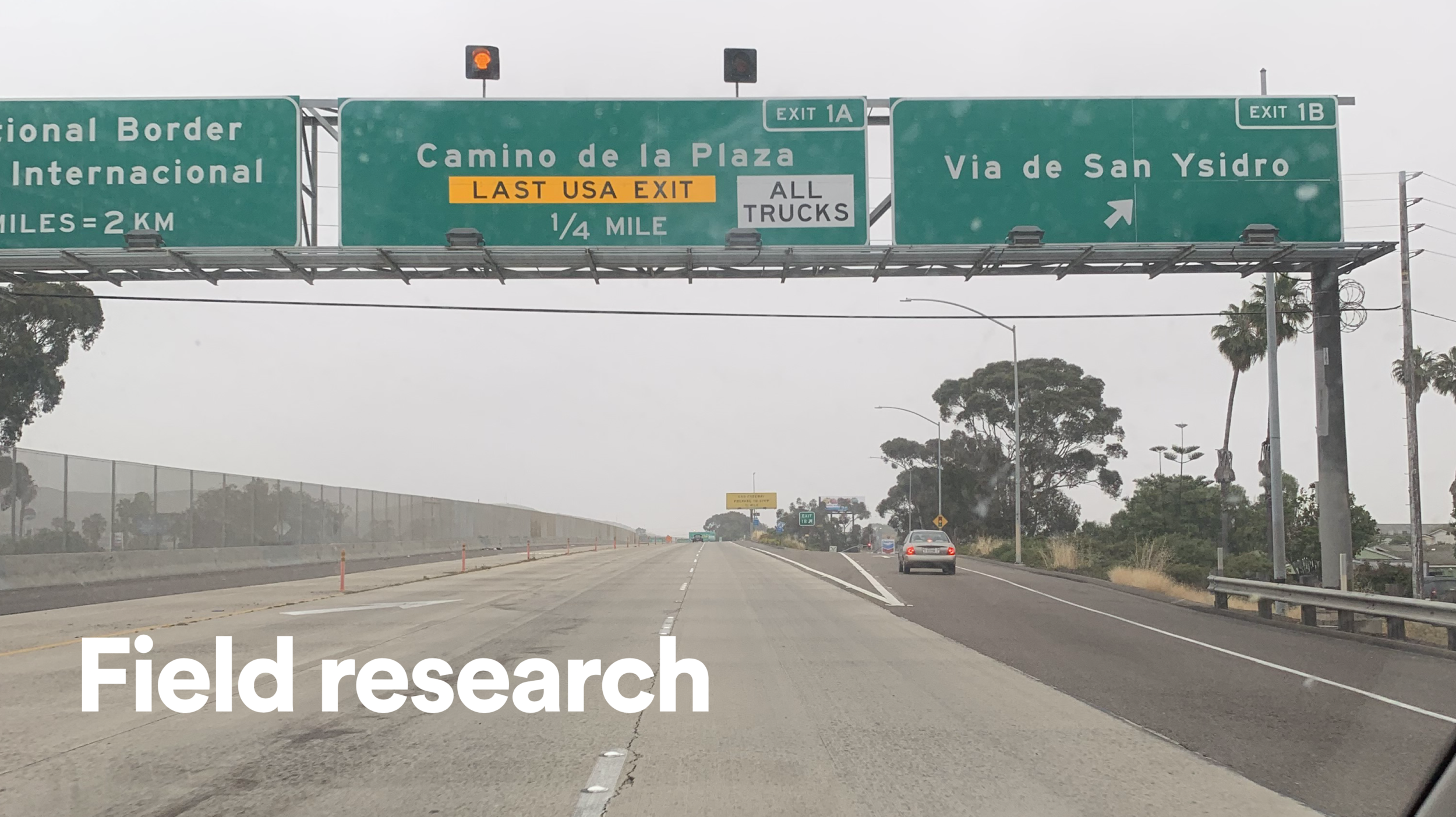
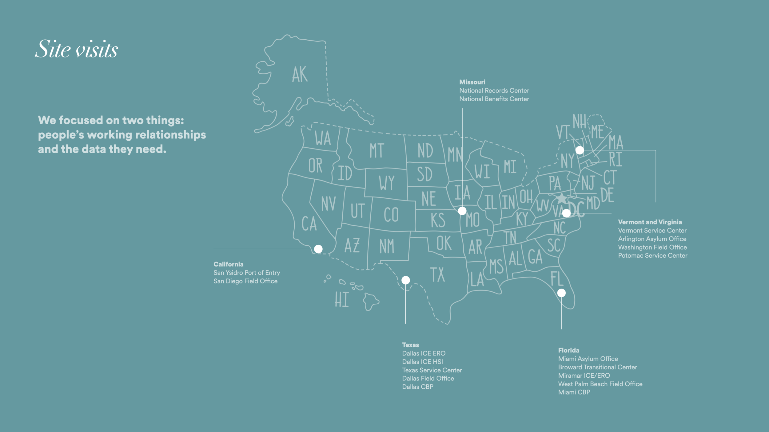
We conducted contextual research at ports of entry along the U.S.-Mexico border and at service centers across the country, shadowing adjudicators, observing intake processes, and conducting over 100 user interviews to understand how identity work actually happened.
The recurring pattern was that people were not making decisions from a single screen. They were assembling confidence from paper files, receipt numbers, biometric records, relationship data, case status, external document stores, and informal knowledge about where to look next.
A form moved through people, paper, queues, and exceptions
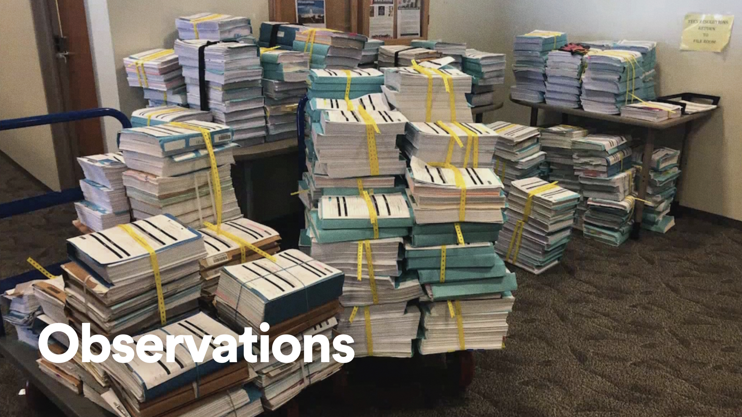
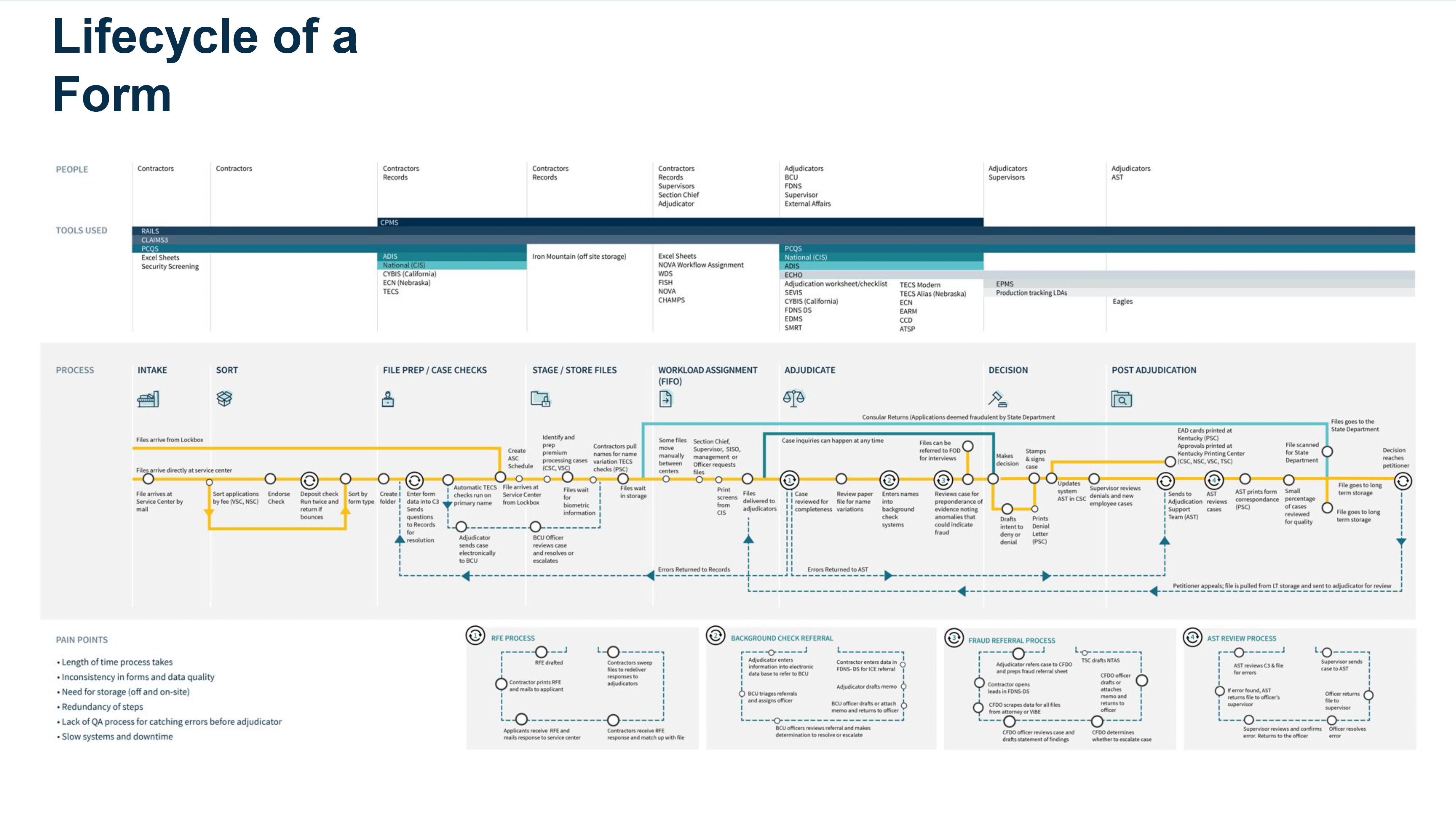
What we found was a heavily paper-based operating model. Case files were physically bundled, routed, stored, pulled, scanned, and reviewed by hand. A single form could pass through intake, sorting, file prep, storage, adjudication, decision, post-adjudication, and exception loops before the work was complete.
Mapping the lifecycle exposed the real design problem: adjudication was not one task, and identity was not one record. The interface needed to support confidence-building across a long chain of handoffs, delays, duplicate steps, and data-quality gaps.
The same person was split across systems and agencies
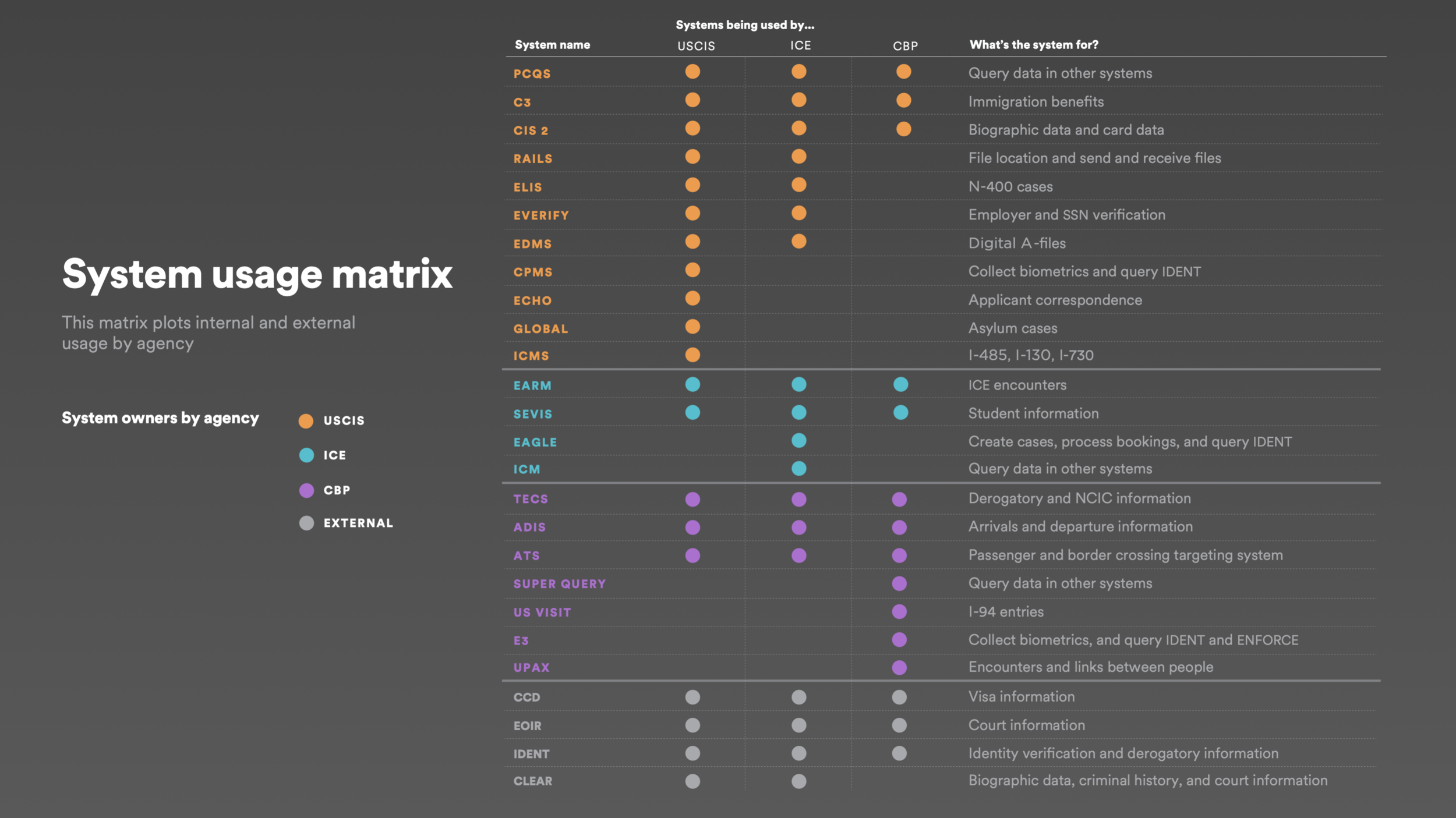
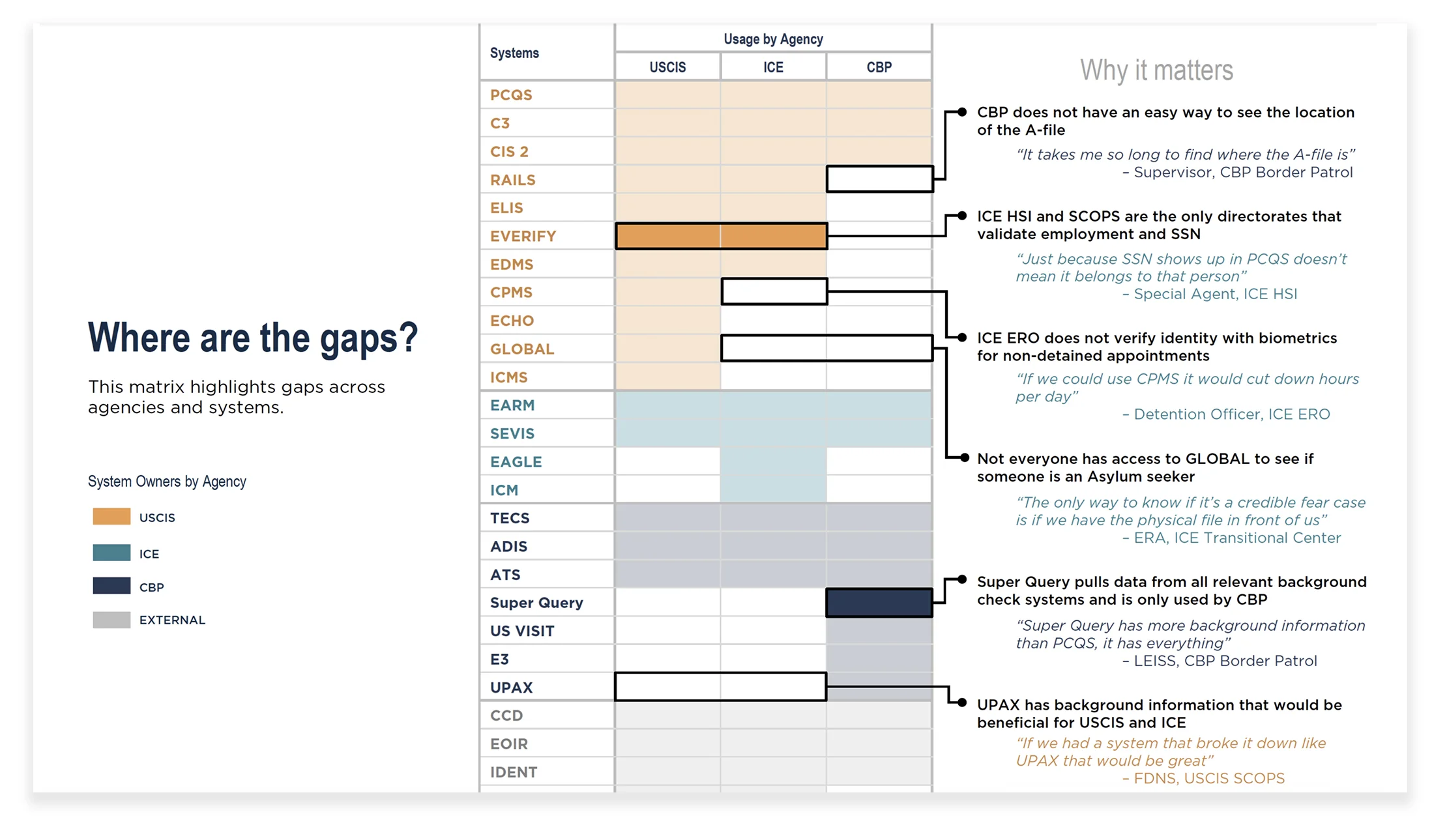
We mapped every system touching the adjudication process: 25+ platforms spanning USCIS, ICE, CBP, and external agencies. The system usage matrix revealed both overlap and absence. Some systems were used for a single data point, while other agencies lacked access to data that would materially change their work.
The research readout made the product opportunity clearer: users did not need another destination to check. They needed a way to bring the right identity evidence, system links, and cross-agency context into one coherent view.
Information moved through relationships, not just databases
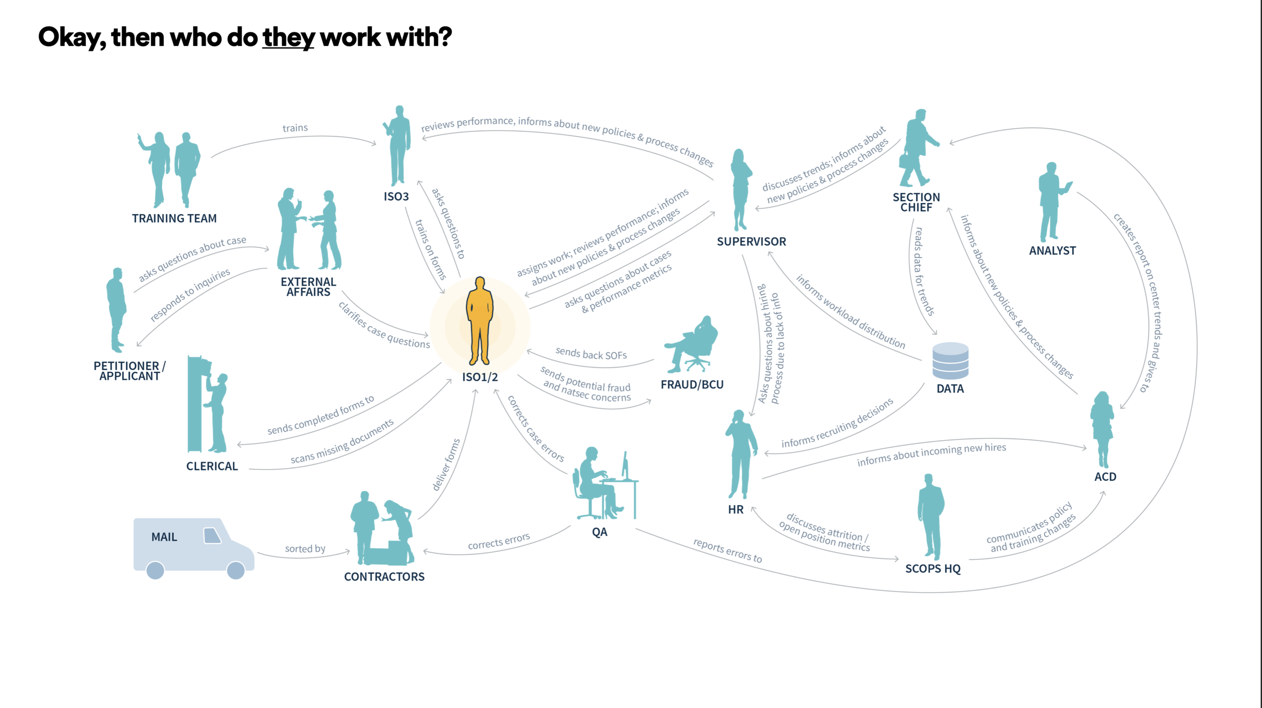
Alongside the systems map, we mapped the human side: supervisors, records teams, section chiefs, external affairs, adjudicators, and other agencies. These relationships shaped how evidence was requested, trusted, escalated, and corrected.
That mattered for the design because an identity view could not just display data. It had to make provenance, related people, case ownership, and next steps understandable enough for officers to act with confidence.
Testing the product model before polishing the interface
We ran 16 design sprint weeks, each focused on a theme surfaced during research. Workshops, sketching, lightning demos, and prototype reviews helped us test not just layouts, but the underlying product model: what information belonged together, what needed to be searchable, and what could be progressively disclosed.
We tested with users at least twice per week, then translated what we learned into interaction patterns, content hierarchy, and implementation-ready documentation for product and engineering partners.
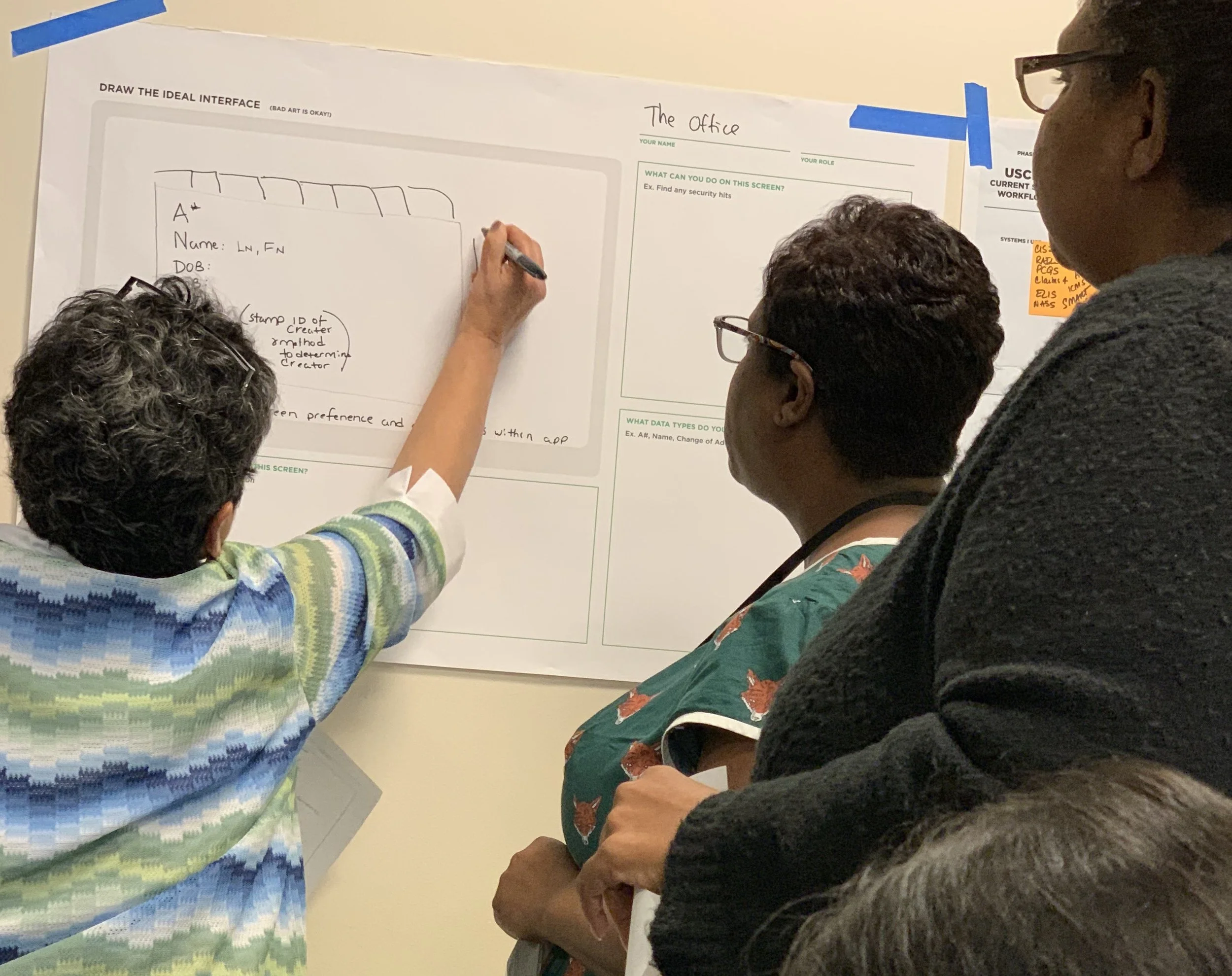
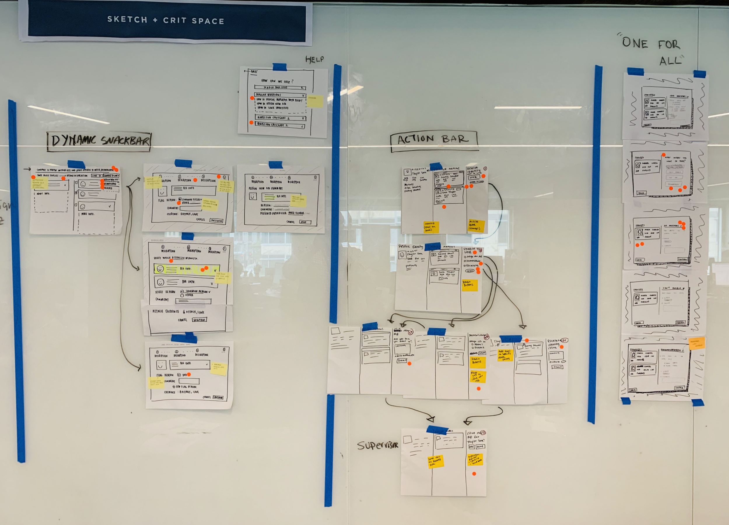
The design challenge was not removing complexity. It was making complexity navigable.
Make the person the organizing unit
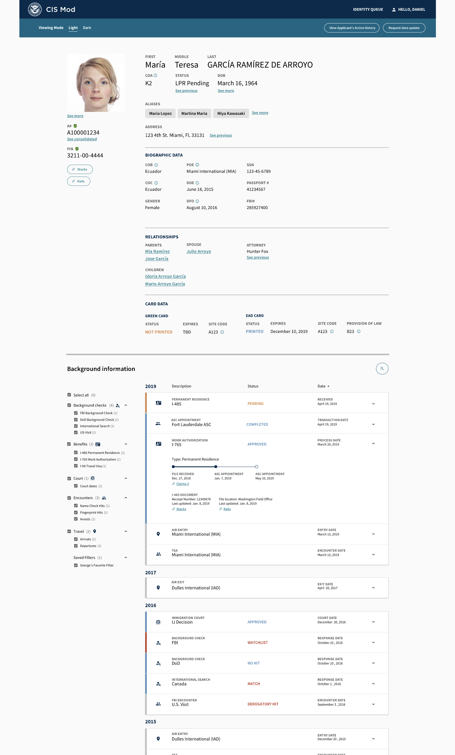
The core idea that survived every iteration was simple: make the person the organizing unit, not the form, receipt number, source system, or office queue. A single A-number search needed to surface the officer's working picture of an applicant: biographic data, biometric evidence, aliases, addresses, relationships, card data, petitions, encounters, background checks, and history over time.
The top of the interface gives officers a fast identity snapshot. The timeline underneath supports deeper adjudication work by showing what happened, when it happened, which system or agency it came from, and where the underlying evidence could be reviewed.
A dense interface organized around officer questions
The final interface uses progressive disclosure. The top card answers, 'Am I looking at the right person?' The timeline answers, 'What happened over time?' Filters, search, and saved views let different roles reduce noise without losing the completeness of the record.
Important ambiguity is exposed instead of hidden: multiple dates of birth, aliases, previous addresses, related people, status history, and card details remain visible because they are part of how officers build confidence. Links to STACKS and RAILS connect digital identity work back to the documents and physical files that still mattered operationally.
Resolving identity required comparison and accountability
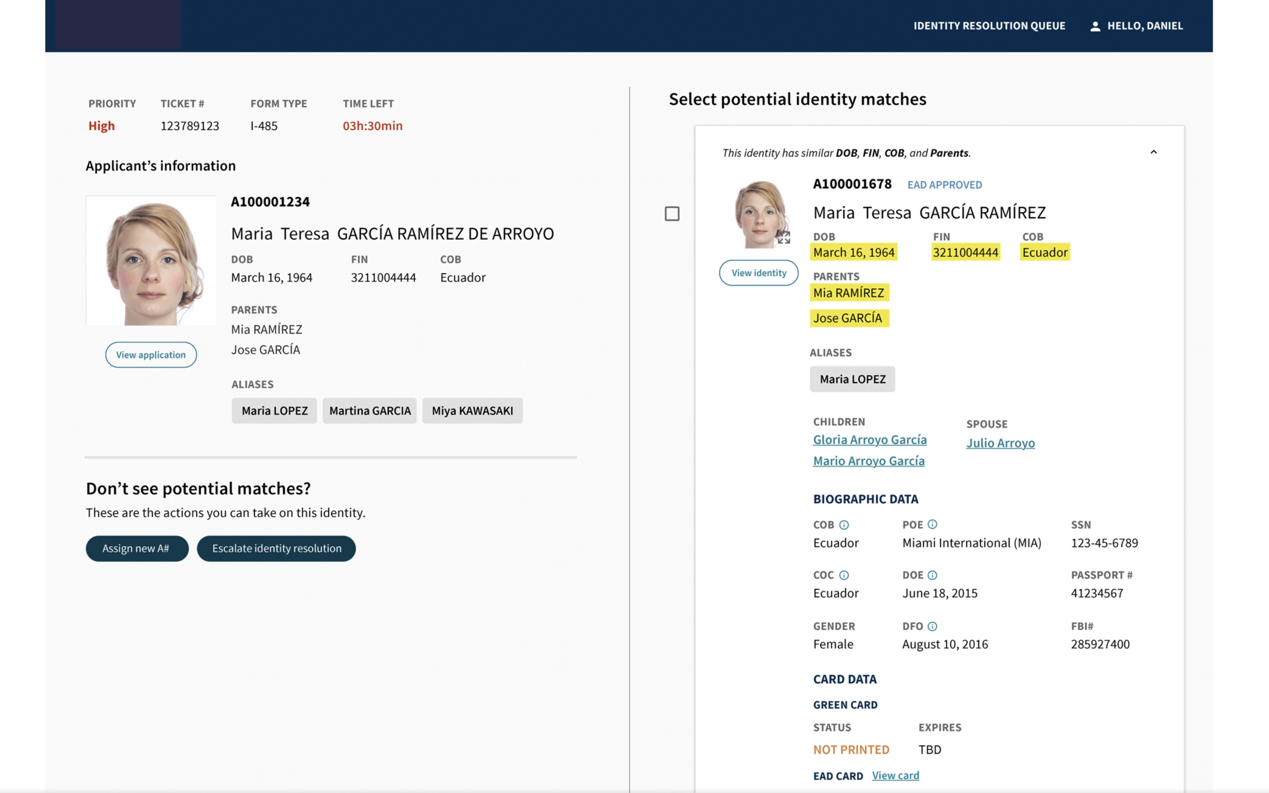
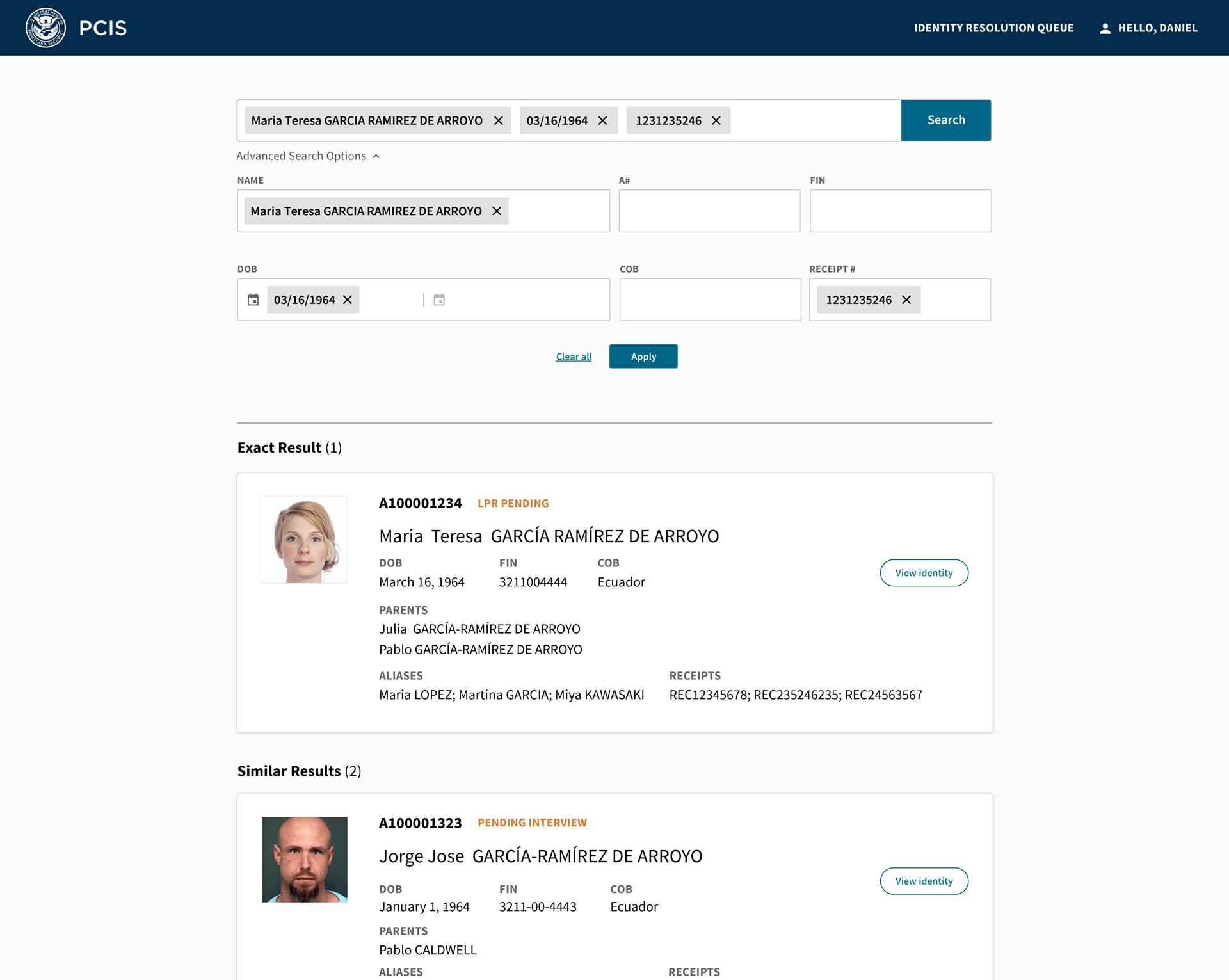
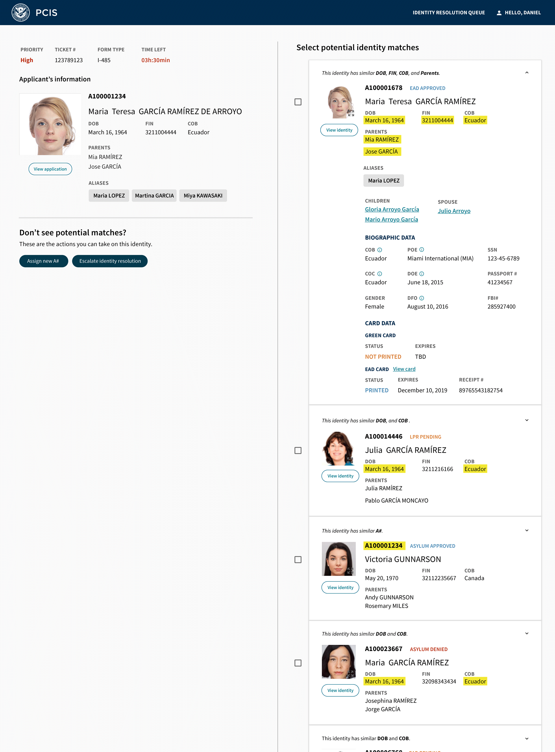
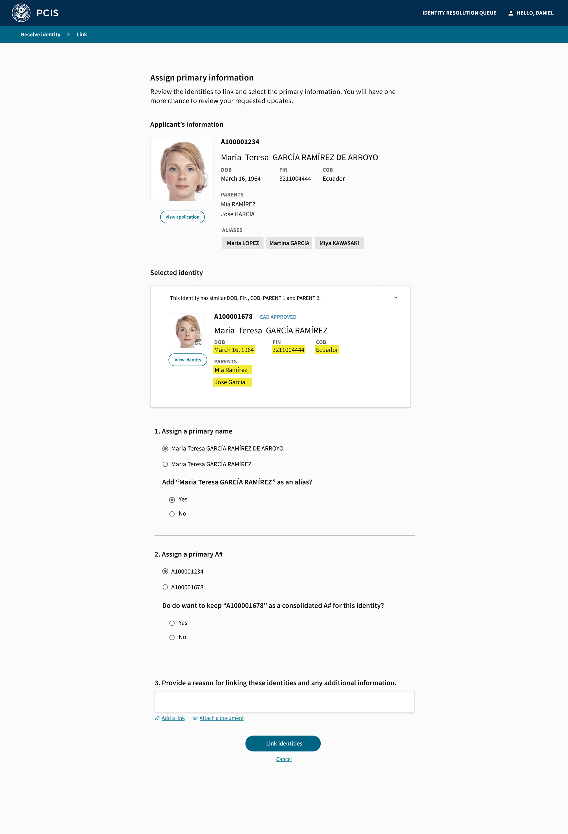
Beyond viewing an applicant's history, officers needed to resolve potential duplicate identities. The workflow had to help them search broadly, compare candidate records, understand why two identities might match, choose the primary values, and document the reason for linking records.
This part of the interface made ambiguity actionable. Highlighted matches showed exactly which data points aligned, while the linking flow asked officers to choose primary information and preserve supporting evidence before making a consequential update.
Evidence stayed close to the decision
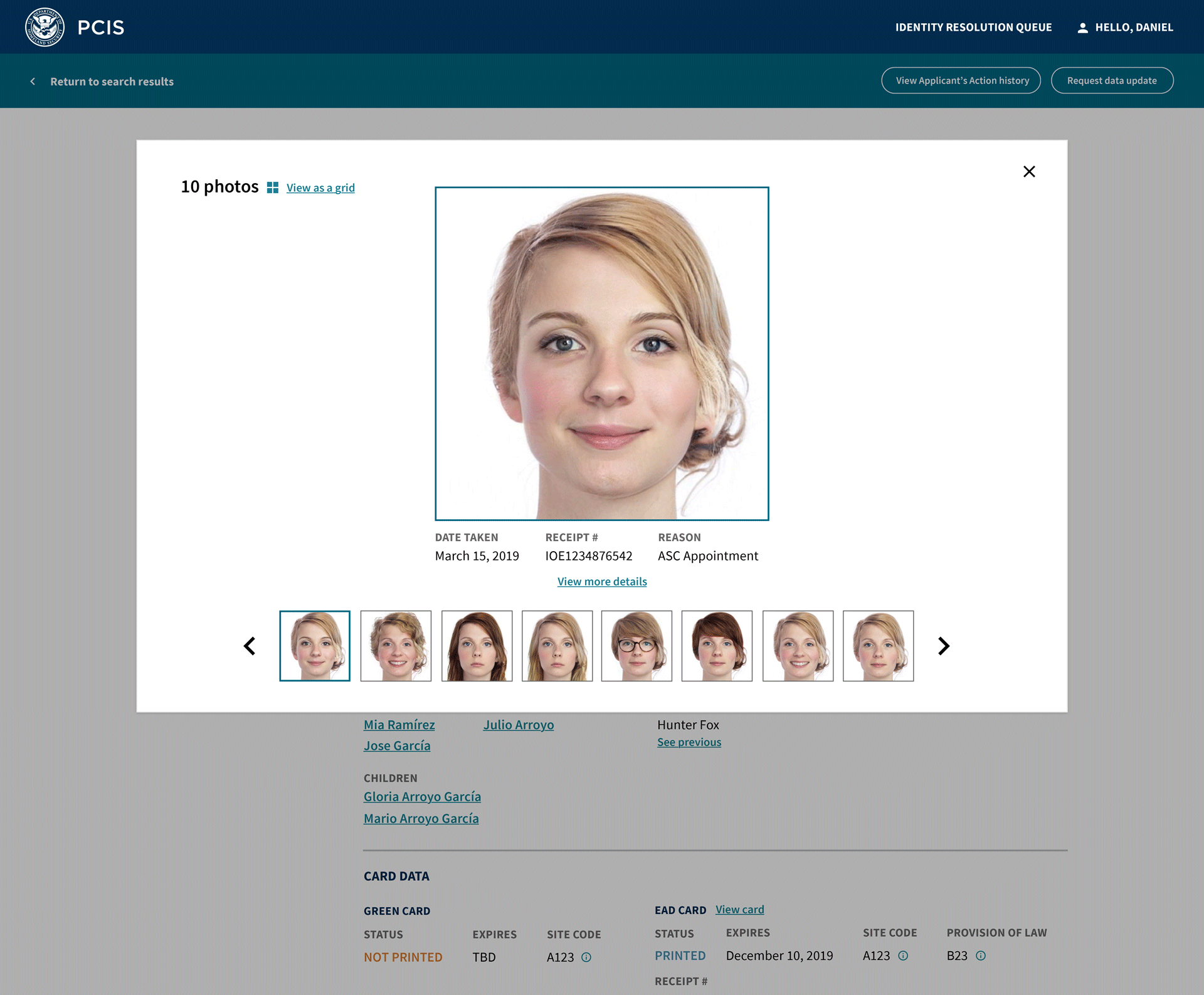
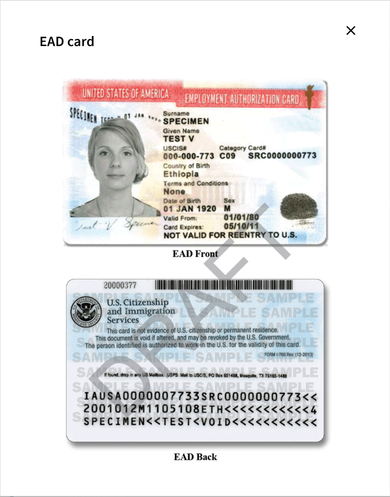
For high-confidence identity decisions, officers needed to inspect evidence without losing their place in the broader workflow. We used focused modals for photos, card artifacts, signatures, and related encounter details so the officer could validate a record and then return to the exact adjudication context.
Photo history was especially important because identity verification happens over time. Side-by-side thumbnails, carousel navigation, dates, receipt numbers, and transaction details let officers compare evidence rather than relying on a single current image.
The card view made the happy path concrete: after officers resolved identity and reviewed supporting evidence, the same person-centric record could carry them through to the issued-card outcome without sending them into another disconnected system.
Bridging legacy evidence while shipping a new product surface
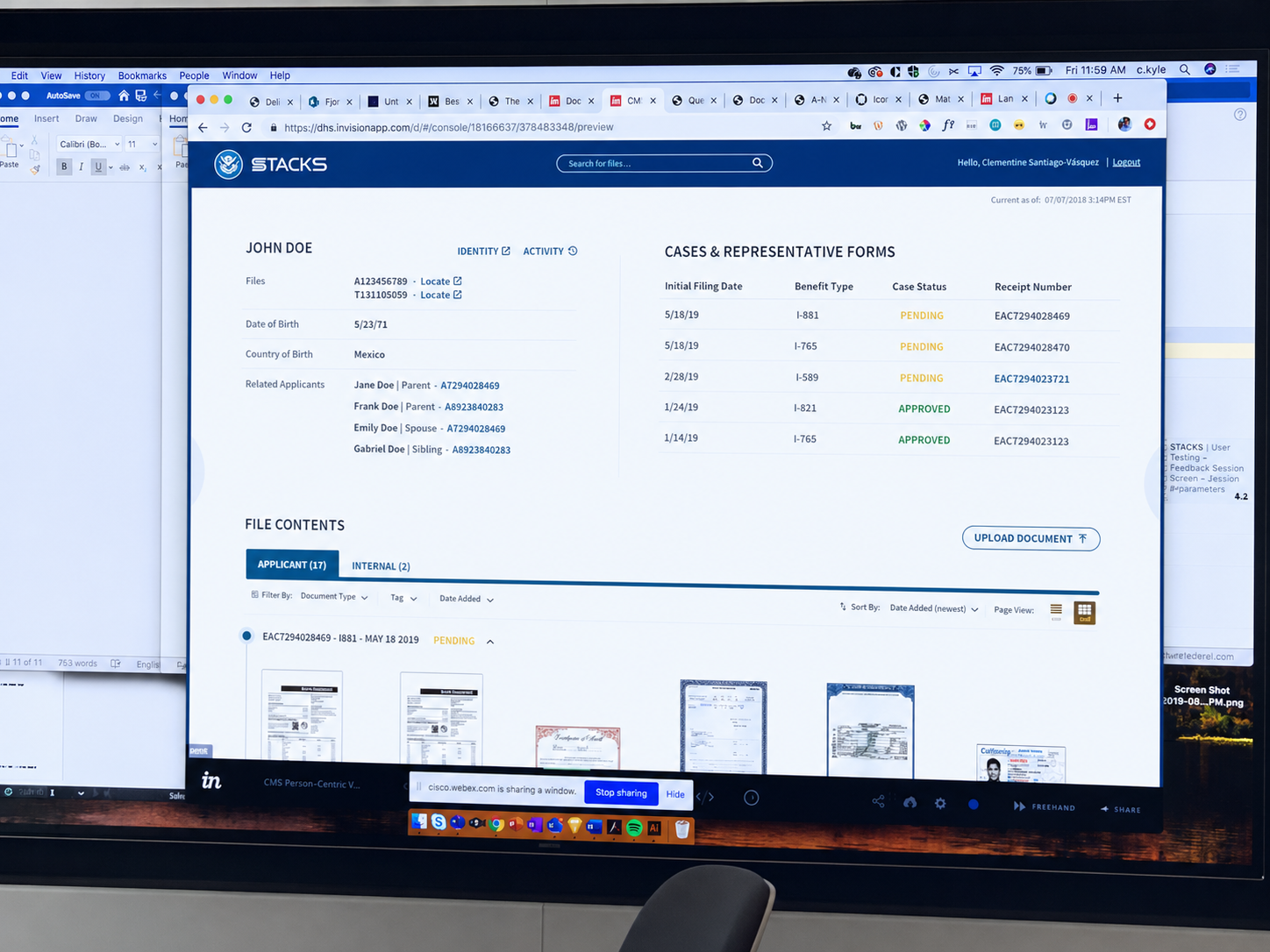
A major product decision was to bridge existing evidence systems instead of pretending they would disappear. Officers still needed access to document images, physical file locations, and historical records, so the new identity view treated those systems as evidence sources inside a more coherent workflow.
The design documentation translated user reasoning into implementable rules: what appears conditionally, how modals behave, how status and history are represented, how filters work, and how each role's access should be constrained through RBAC/ABAC and audit lineage.
A person-centric foundation for identity work
By consolidating fragmented evidence into a unified, person-centric platform, adjudicators gained a clearer way to confirm applicant identity, review history, inspect supporting evidence, and understand provenance. CIS 2 became a foundation for downstream DHS identity services, with cross-record timelines, granular RBAC/ABAC controls, and full audit lineage.
My contribution
Key Personnel
Design Leadership
Field Research
Co-creation Workshops
Identity & Case-Management UX
RBAC / ABAC Design
Interaction Design
Iterative Prototyping
Delivery
Collaborators
1 Design Lead
4 IxD
1 VizD
1 Business Designer
Tools
Figma
Prototyping
Next project
Vulcan
DoD Innovation Platform